Animated Explainer Videos by Cognitive
Our creative team transform your message into shareable, engaging and memorable explainer videos.
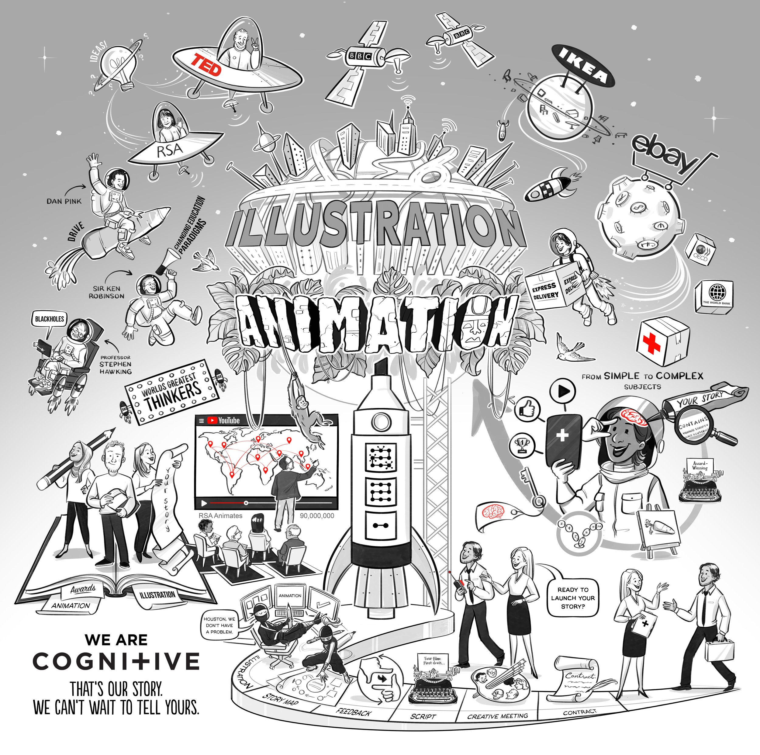
Why should you use an animated explainer video?
Animated explainer videos are an amazing way to let your audience, and the world, know about your story, latest message or idea. They supercharge your content with a combination of custom made illustrations, engaging animation and approachable voiceovers. This powerful combination makes your message more memorable, more engaging and more entertaining - the perfect trio for an increasingly digital and distracting world.
To compare just what kind of impact an animated explainer video has compared with a more traditional ‘talking head’ video, we compared the two.
We were delighted to have the opportunity to conduct this research with Richard Wiseman, Professor of the Public Understanding of Psychology at the University of Hertfordshire.
Together, we found that the animated explainer video:
was 66% more likely to be shared
resulted in a 15% increase in information retention
was 33% more entertaining
How do we make them?
We employ the most interesting imagery – images, icons, diagrams, and videos – weave it together into a story, breathe life into it with fun animations and a voiceover …and whoa … it’s ready for consumption! Or should we say mass consumption? Our animations for the RSA Animates series have attracted over 100 million views, bringing complex and dry content to life.
The first step is a meeting with you; where we understand who you are, what you want to say and how you want to say it. Our talented writers then turn your message into an engaging script, and once you’re happy with it, our illustrators use it to create rich visuals and characters that will bring your ideas to life.
Once you’ve signed these off, our animators create a first version of the animated explainer video. While all this is happening, we ask you about voiceovers and record the one which is the perfect fit at a professional studio.
All of this then comes together into your finished explainer video, bursting with information and charm, and ready to go out and engage viewers as it tells your story.
Our talented team of creative award-winning professionals has as much fun telling your story as your audience will watching it. Storytelling is an art, and we can confidently say we’ve mastered it with our trademark whiteboard animation technique.
Who we do it for














No matter how simple or complex, mundane or out-of-the-box your story or the story of your products and services, our animated explainer videos can lay it all out in a digestible, engaging, and unforgettable style. More importantly, we will tell your story in a way that is tailored to your business and your goals.
Whether you’re trying to market your company’s offerings, simply educate your customers, or raise public awareness, our animated explainer videos can do it all. We feel honoured to have done this for organisations like the BBC, Google, Deloitte, The World Bank, Coca Cola and TED-Ed.
Here are our latest animated explainer videos:
Wrisk approached us with a challenge: to distil their cutting-edge platform into an engaging, accessible animation that speaks to diverse audiences—from automotive innovators to insurance professionals.
Dallington approached us to create an animation that captures the depth and impact of their mentorship programme. They needed something authentic and engaging, speaking directly to young people and their families without feeling over-polished or forced.
ACT Leadership approached us with a challenge: how to express their leadership philosophy in a way that felt clear, compelling, and true to their values.
The TuBerculosis Vaccine Initiative (TBVI) work to support, integrate and prioritise R&D efforts. We were honoured to help the TBVI raise awareness about this important subject and their Pathway tool.
We collaborated with the World Bank to create a whiteboard explainer video to raise awareness about gender-based violence.
To help UNESCO and IIEP report findings from their Quality Management Programme, they asked us to share their experiences through accessible explainer videos aimed at a variety of different stakeholders.
To rally support from policymakers and donors, the WHO collaborated with Cognitive to create a compelling whiteboard animation. This animation aimed to humanise the issue and inspire investment in preventative measures, focusing on the Eastern Mediterranean region.
The aim of Sustainable Development Goal 6 is to ensure that by 2030, everyone has access to clean water and sanitation. However, as 2030 approaches, we must face the fact that we’re falling behind. To meet the deadline we must embrace change. To create this change, the World Bank has established the Utilities of the Future Center of Excellence!
For cottage owners, life is busy enough without having to spend extra time keeping tabs on maintenance! Cottage Companion knows this and has created an app that allows you to track tasks and progress in real time.
Chegg supports students to study better, learn more in less time and achieve better grades. This takes a wide range of tools and solutions, but when it comes to challenging and hard-to-grasp topics, like those found in science, nothing beats an explainer video.
Where it all started - the RSA Animates animated explainer video series
Back in 2008 we started working with The Royal Society of Arts, creating animated Explainer Videos around some of their keynote speeches. The speeches were often complex, sometimes dry and had low engagement rates. Our trademark Whiteboard Animation approach made this content engaging, understandable and memorable. Today the series has had over 100 million YouTube views!
Read more about how animated explainer videos and visual storytelling can supercharge your story:
In the modern workplace, where attention spans are short, and information overload is common, utilizing innovative internal communication strategies is crucial. This article explores creative internal comms ideas, focusing on the power of animated explainer videos and whiteboard animations.
Often the very first books we encounter are picture books, our first introduction to the power of rich visual language. While our books change, the power of this language doesn’t. We’ve reflected on visual language, from picture books to explainer videos and whiteboard animation.
Whether it's making complex ideas feel simple or dry subjects feel engaging, our mission is to democratise knowledge. For over twenty years, we’ve been making this mission a reality, working on whiteboard explainer videos for clients across sectors ranging from education and health to international law and energy.
The best bit of our job is working with clients who have big ideas and complex messages. We’re always ready to make a complicated message feel relatable and understandable or help a visionary get their message out to the masses.
As pioneers of whiteboard animation videos, we’re proud of its ability to make the complex simple and share information far and wide. We want to share its explainer and storytelling superpowers with as many people as possible, but to quote a modern-day classic, ‘with great power comes great responsibility.’ That sometimes means saying ‘no’.
In today’s digital era, explainer videos have become indispensable tools for businesses, educators, and creatives to convey complex ideas in a clear and engaging manner. These videos, whether animated or utilizing techniques like whiteboard animation, captivate audiences and simplify intricate concepts.
We see whiteboard animation as a way of democratising knowledge and sharing the ideas that help us all understand and build a better, fairer world. It is packed with educational and visual storytelling tools that allow us to connect with viewers as we make even the biggest ideas accessible and understandable.
What’s the biggest hype narrative you’ve fallen for recently? Drop it below—no judgment. We’ve all bought something at 11 pm thinking it was genius, only to regret it by morning. (Although the Velcro drain unblocker is the shit!)
The Parker Probe isn’t just a shiny example of what humans can achieve when they stop arguing on X for five minutes. It’s also a reminder that big problems—whether they’re cosmic or corporate—need both boldness and a plan.
When we strip away the layers of imposter syndrome, it often boils down to storytelling—about who we are, what we’ve done, and where we’re headed. The narratives we tell ourselves shape our reality, and reframing those stories can unlock a healthier sense of self-worth.
Facebook and Instagram are going “back to their roots” of free expression. Because, clearly, what the internet desperately needed in 2025 was more rucks.
Watching The Traitors is like observing a high-stakes version of a spider weaving its web. Every accusation, every alliance, every teary-eyed confession pulls on the delicate threads of trust until the whole thing collapses in a heap of suspicion.
Ah, New Year’s resolutions. The annual tradition where we collectively trick ourselves into believing we’re only one heroic declaration away from becoming flawless human beings. This year, this will be the year we shed those bad habits like a moulting snake. Right? Wrong!
If you could pin down the essence of truth, could you draw it? That’s the question that lingered in my mind after speaking with Dan Ariely for my RSA Animate documentary—a project allowing me to reconnect with some of the most compelling thinkers of our time.
I have written a lot about failure. It’s something of a fascination for me. I am in a constantly evolving process with failure. When does failure become a success? Are there any true failures or is it just an endless process?
If you’ve spent any time in creative circles, you’ll know that while education has the potential to transform, we’ve been wielding this so-called "weapon" like a blunt instrument for far too long.
No matter where we find ourselves on the spectrum of human experience, creativity can play a vital role in survival, healing, and hope.
AI could revolutionise the NHS by taking on administrative tasks, giving doctors more time to spend with their patients. However, while this sounds like a dream solution, it comes with challenges. With great power comes great potential for, let’s face it, accidental chaos.
So, here’s the reflective takeaway: in a world of endless scrolling and relentless sameness, being bold is essential, but it’s only the first step. Jaguar has smashed the glass case, but now they need to decide what to do with the diamond.
Let’s face it, presenting isn’t just about showing up with slides and stats. It’s a performance. A dance. A chance to make ideas leap off the screen and stick. But how do you know if you’re nailing it? That’s where the Presentation Pulse Check comes in.
The familiar feels safe, even when it’s clearly sinking. Here’s the harsh truth: in a world that moves as fast as a TikTok trend, being slow to adapt is a recipe for stagnation.
Over-complication isn’t just tedious—it’s the nemesis of efficiency. Enter the KISS principle: “Keep It Simple, Stupid.”
Here’s the thing about getting comfortable – it’s the silent killer of real growth, and I am not talking about bottom-line growth – I’m talking about the type of growth that is far more valuable.
Ah, the Inverted Pyramid—It sounds like a tragic prog rock album you might find at a car boot sale, but it’s a concept that’s as intriguing as it is practical.
Sometimes it’s bloody tempting to focus on fighting today’s fires while forgetting the bigger picture, isn’t it?
Affordance is how something shows you what it can do, like a door handle that makes you want to pull the door open or a button that looks like it should be pressed.
Have you ever been in a meeting where you could just feel your team's energy slipping away? Sometimes meetings drag on, and fresh ideas are as rare as a decent cup of tea, well, in the whole of America!
This peculiar proportion, approximately 1.618, has been lurking in the shadows of human creativity for millennia, like a mathematical James Bond, seducing architects, artists, and designers with its promise of perfection.
Have you ever been in a meeting where you could just feel your team's energy slipping away? Sometimes meetings drag on, and fresh ideas are as rare as a decent cup of tea, well, in the whole of America!




Explainer videos and engaging whiteboard animations, have emerged as powerful tools to convey complex messages with simplicity and creativity. Here, we explore nine innovative ways to integrate explainer animations into your marketing strategy, enhancing your brand's visibility, engagement, and conversion rates.